HOME
LONDON
ASSIGNMENTS
Typographic posters
Subjective map
GPS beep beep
City walk
Research questions
Mixed map
What is internet
Drawing techniques
Dust jacket
Self portraits
Exploration of lines
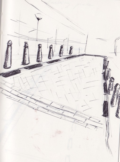
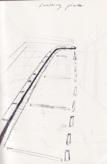
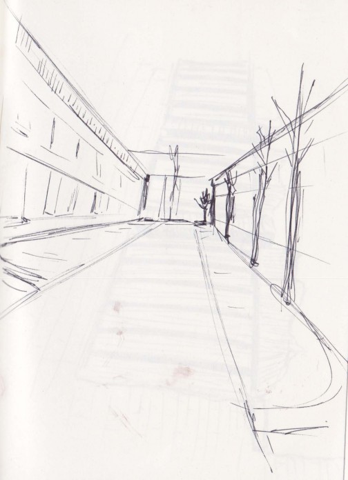
This selection is based on different kind of lines that can be found in public spaces.
(a.k.a. outside)
These lines tell you what to do (or what you are supposed to do).
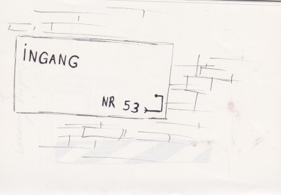
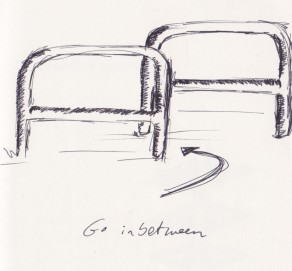
The “ingang” sign, tells you that the entrance is around the corner, the two fences force you to go in between them (or to make you get off of your bike (super annoying)).
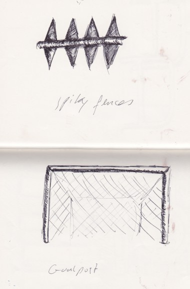
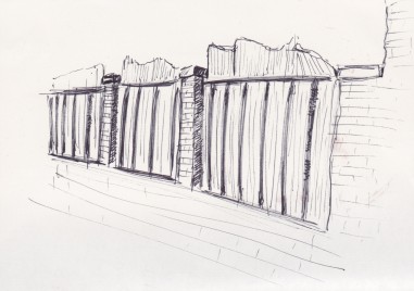
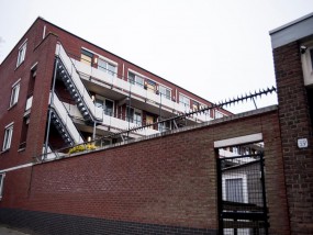
The spiked fences tell you to get the hell off ma property!
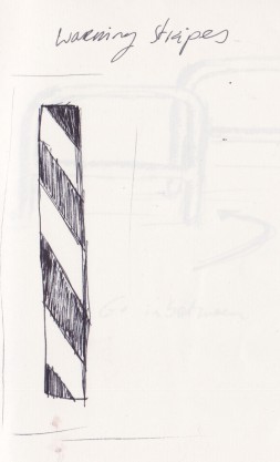
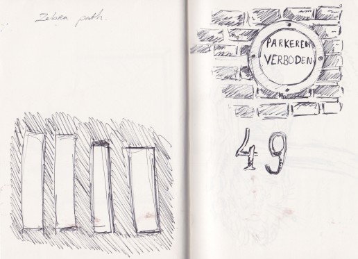
Some objects include laws such as a “no parking” sign, or a … zebra path (????)
Others tell you where to aim or where to sit.
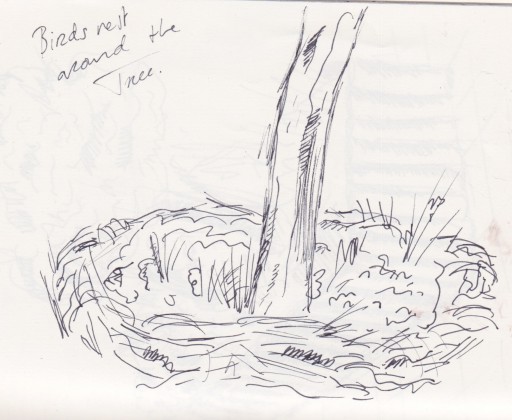
There are also natural lines, like the thick line of bushes around the tree. I think it is meant to keep people from walking on that piece of “nature”.
A different one is the little garden surrounded by wooden poles. I don’t think you’re allowed to walk through it, but I think the poles are meant to keep the garden together, like a huge flower pot.
Trees can also be used to make a border. For instance to keep people from parking on the sidewalk. (I hate it when they do that)
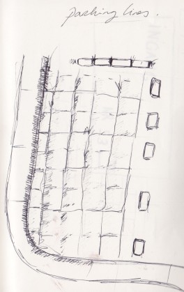
Other borders are borders made by the little pawns, or just simply painted lines on the road.
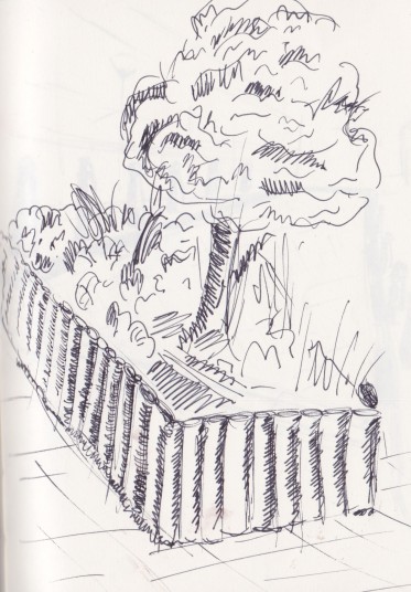
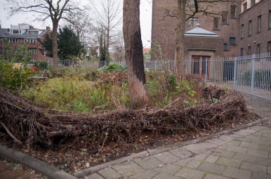

3. A DISMISSED GARDEN
This example of a line shows multiple wooden poles poles which reastrain a public garden. The garden is located amongst concrete slabs. This modest piece of green which stems amongst concrete slabs is not maintained well. It does not have its function – it is a kind of unnecessary object, which people want to push aside from the public. The concrete slabs and wooden poles are taking the control over the plants trying to displace them. Nobody cares about the garden.
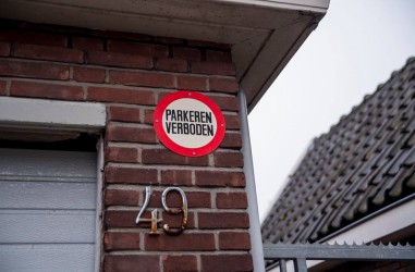
1. PARKEREN VERBODEN – NO PARKING
Road signage is probably the most apparent example of lines considered in terms of rules. Walking across the streets of Charlois we noticed the ordinary prohibition sign saying "NO PARKING". The sign is sticked to the bricked wall just near the entrance to somebody's garage. The recipients of this message are those who can think of parking their car in front of the garage blocking the entrance. The round, white, metal plate with the red outline and black typography (bold, capital, sans-serif letters) has a strict, but in the same time oldschool, "gezellig" look. On the other hand the bricked wall, the fence with spikes and the rusty house number make the sign look more strict.
This example made us think how important the context of a line is.
Manual
Intervention
Illustration